Building a Brand
Verity was created to provide represenation and appreciation for the trans community while inviting those from outside the community to broaden their knowledge of the gender spectum.
Let’s take a look at my process!
Verity was created to provide represenation and appreciation for the trans community while inviting those from outside the community to broaden their knowledge of the gender spectum.
Let’s take a look at my process!
Background
This project was originally created as my final in an Indigenous Feminist Futures course I took during my third year at univeristy. It was in the following semester that I began to further develop Verity into what it is today. Through this initial version of this project, I created four primary characters and illustrated the concept art of the dolls in their respective packaging.
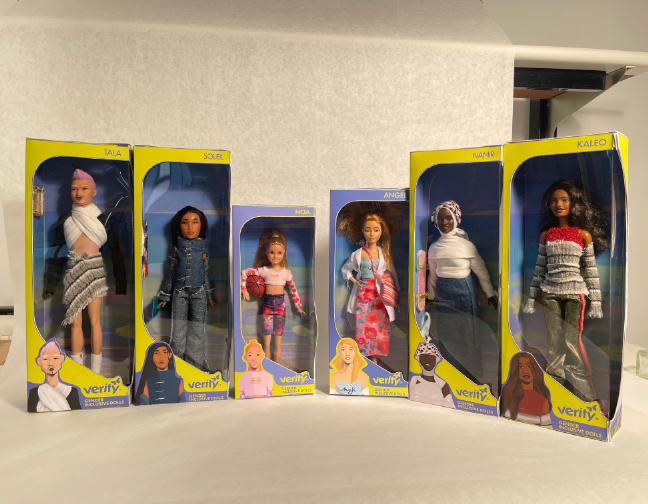
The Dolls:
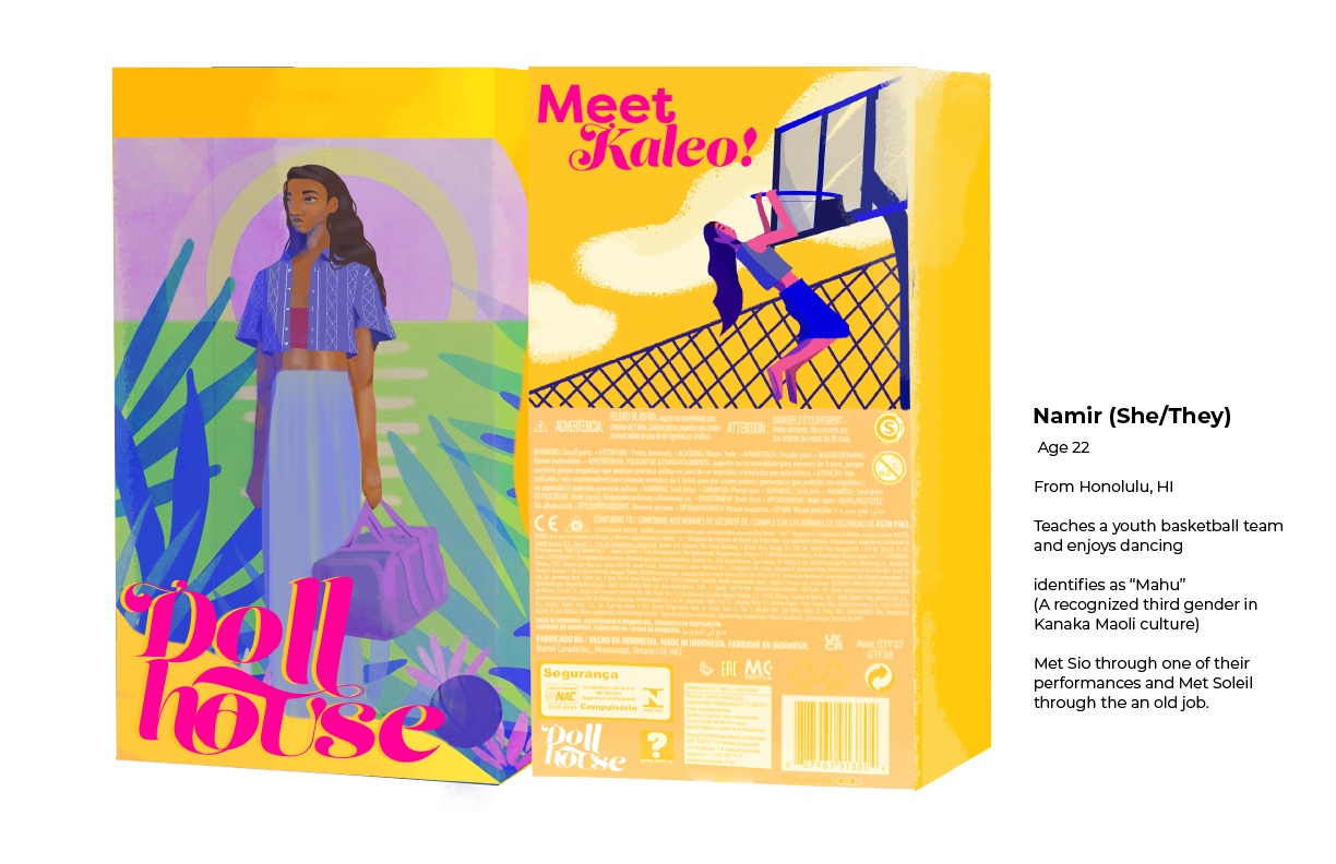
Namir (She/Her)
A nineteen-year-old Black muslim woman from Chicago. Namir identies as non-binary and transfemme. Non-binary refers to individuals who do not identify as a man or woman. Transfemme refers to a transgender individual who identifies more strongly with their femininity.
Soleil (He/They)
A twenty three-year-old fashion designer and painter from northern Idaho. He identifies as Two-Spirit which is an umbrella term used in some Native communities to describe individuals who transcend the gender binary.
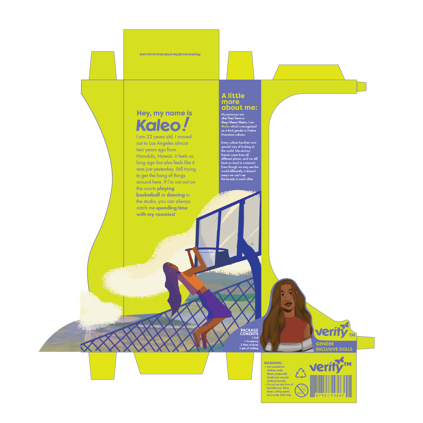
Kaleo (She/They)
A twenty two-year-old dancer and basketball player from Honolulu. Kaleo idenitfies as Mahu which is recognized as a third gender in Hawaiian/Kanaka Maoli culture.
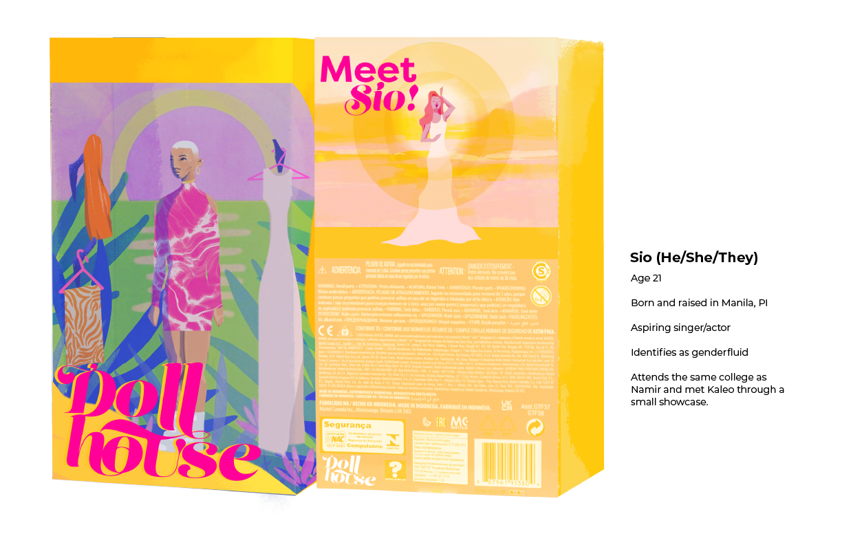
Sio (He, She, They)
A twenty one-year-old actress/singer from the Philippines. Sio identifies as genderfluid which refers to an individual whose gender identity and gender expression may change over time.
A twenty two-year-old dancer and basketball player from Honolulu. Kaleo idenitfies as Mahu which is recognized as a third gender in Hawaiian/Kanaka Maoli culture.
Sio (He, She, They)
A twenty one-year-old actress/singer from the Philippines. Sio identifies as genderfluid which refers to an individual whose gender identity and gender expression may change over time.


Brand Strategy
1. Creating a Brief
A brief is an essential component in solidifying the mission, essence, and scope of any project.
![]()
A brief is an essential component in solidifying the mission, essence, and scope of any project.

2. Mind Map
The mind map is one of the most important factors of my process. For me mind mapping can allow for the introduction of concepts, but it can also just be a space to release any rudimentary ideas.![]()
The mind map is one of the most important factors of my process. For me mind mapping can allow for the introduction of concepts, but it can also just be a space to release any rudimentary ideas.

3. Naming
Naming can be a trickier part of my process. With this project I wanted to draw from words which associated to the idea of transitioning and the transcommunity.
![]()
![]()
As shown above, I initially chose the name “Doll House” referring to the term “dolls” which is a self-identifiable term used by many trans women. In the end, I chose “Verity” as it means truth, which is an essential element of transitioning and fully living as your true self.
My naming process was coincided by logo development. I chose Dunbar Tall Medium and softened some areas of the letter forms to be more playful and kid-friendly. I also wanted to maintain this concept of metamorphasis and evolution; To do this I kept the butterfly motif, as the butterfly is known for the beauty of its transformation.
Naming can be a trickier part of my process. With this project I wanted to draw from words which associated to the idea of transitioning and the transcommunity.
As shown above, I initially chose the name “Doll House” referring to the term “dolls” which is a self-identifiable term used by many trans women. In the end, I chose “Verity” as it means truth, which is an essential element of transitioning and fully living as your true self.
My naming process was coincided by logo development. I chose Dunbar Tall Medium and softened some areas of the letter forms to be more playful and kid-friendly. I also wanted to maintain this concept of metamorphasis and evolution; To do this I kept the butterfly motif, as the butterfly is known for the beauty of its transformation.
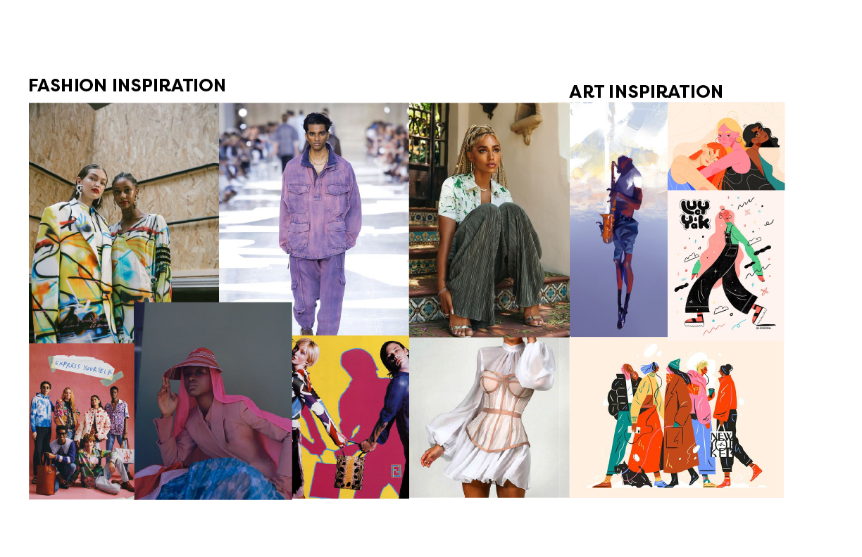
4. Visual Research
Because fashion and style are very important elements of gender expression, I looked to several fashion illustrations and runway pieces when solidifying the style guide for the illustrations and styling of the dolls.
Because fashion and style are very important elements of gender expression, I looked to several fashion illustrations and runway pieces when solidifying the style guide for the illustrations and styling of the dolls.
5. Story Development/Character Design
When looking over my work, my peers introduced the idea of including different age ranges of dolls for younger audiences to grow with the dolls. This decision sparked the creation of two new characters: Angel and Noa
Angel:
A fifteen-year-old aspiring designer. She is the younger cousin of Tala. (Originally “Sio”) Angel identifies as a transgender, meaning she does not identify as the gender she was assigned at birth.
Noa:
An eleven-year-old child living in Santa Monica with their two moms and five younger sibings. They are the captain of the youth basketball team coached by Kaleo. Noa identifies as Non-binary which refers to individuals who do not identify as a boy or girl.

Production
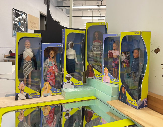
6. Package Design
When creating the form of the box, I wanted to implement fluidity as it relates to gender. I also wanted detract from the conventional open front-facing box typically used for doll packaging. I also wanted to craft designs that also recognized the importance of sharing the backstory/background of the dolls. Furthermore, I decided to have an open face on the side of the packaging as well.
Upon researching other doll packages shown in retail stores, I unsurprisingly came across many shades of pink. I love the color, but not for this. I found that the lemon lime green as a primary color would stand out well while remaining playful and engaging.
For the illustrations, I implemented two art styles to expand visual interest. I was inspired by other productions which use multiple styles in their work. (Ex. Inside Out and The Amazing World of Gumball) Each illustration took two hours to complete.

7. Brand Guideline
![]()

9. Copywriting
Copywriting was a more difficult portion of this project as I had to flucuate between language more suitable for younger audiences and their parents as well. W hen implementing copy onto the packaging, I found it important to vary between personal language - from the perspective of the characters - and informational language to help immerse audiences into the story while introducing different gender identities.
Copywriting was a more difficult portion of this project as I had to flucuate between language more suitable for younger audiences and their parents as well. W hen implementing copy onto the packaging, I found it important to vary between personal language - from the perspective of the characters - and informational language to help immerse audiences into the story while introducing different gender identities.
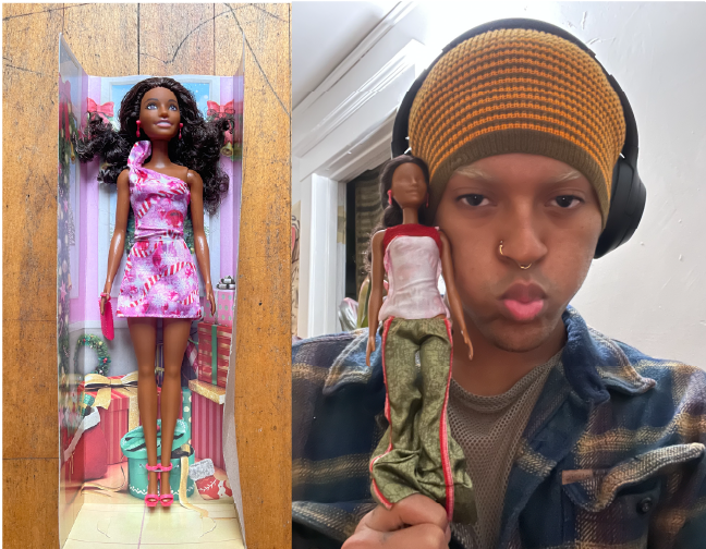
10. Construction
- Dolls
Face: After having watched several doll face-repainting videos, I knew I would have to bite the bullet and try it for myself. After wiping off the original faces painted onto the dolls, I would sketch, repaint, and highlight their faces. On average, each doll took an hour to complete.
Hair: For Tala, I repainted his hair from brown to a soft pink. For Namir, Angel, and Noa, I trimmed and reshaped their hairstyles.
Clothes: To creat new outfits for the dolls, I handmade a few of the tops and bottoms shown on Tala, Kaleo, Namir, and Soleil. For the rest, I repurposed pieces from the dolls original clothing items.
- Packaging
In order to create seemless packaging, I needed to create an exterior and interior sleeve. The interior sleeve would allow me to secure the dolls into place with fishing wire while the exterior sleeve would envelop the closures. Using two layers for the packaging also provided more strength and protection for the dolls.


Marketing
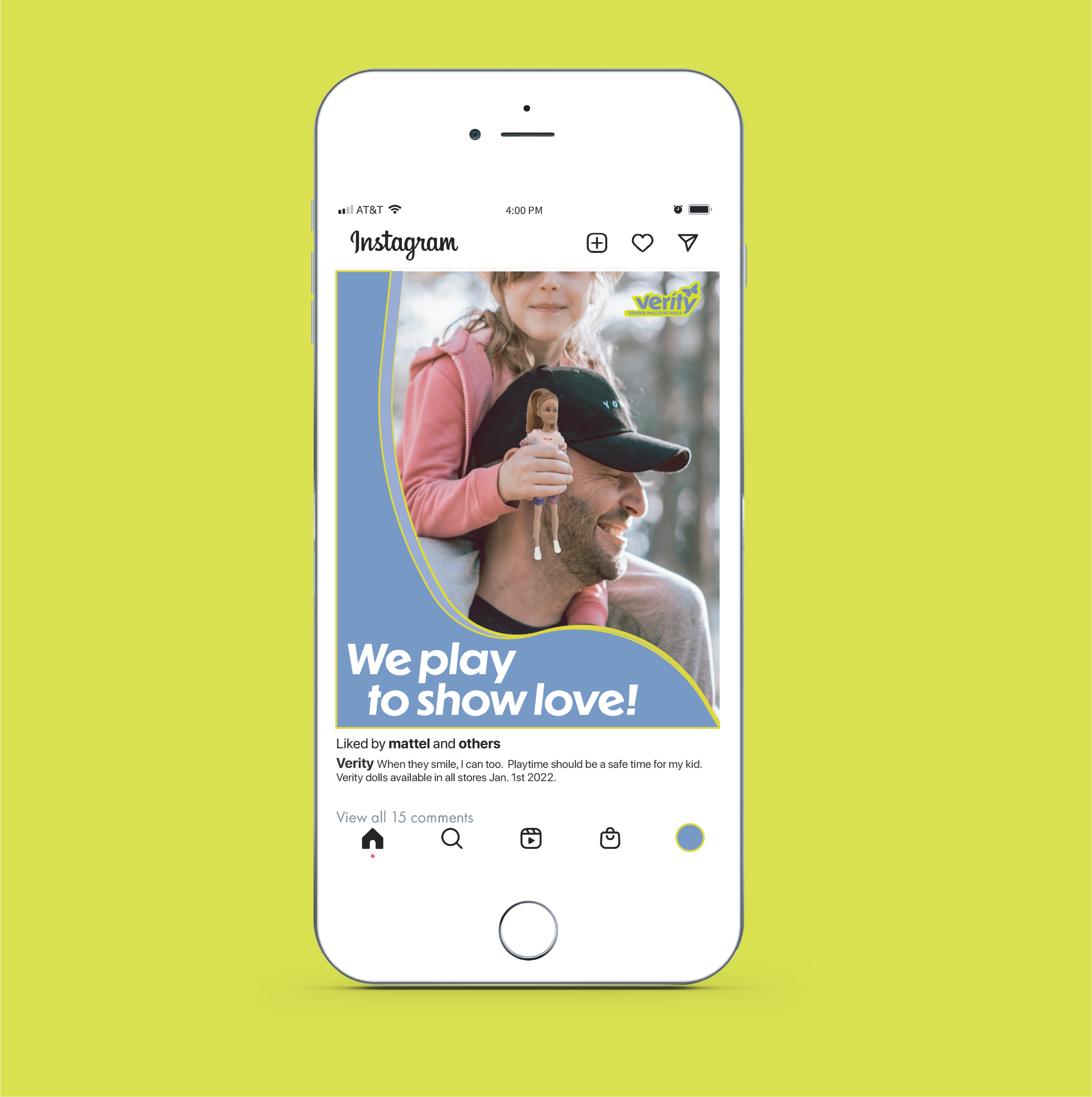
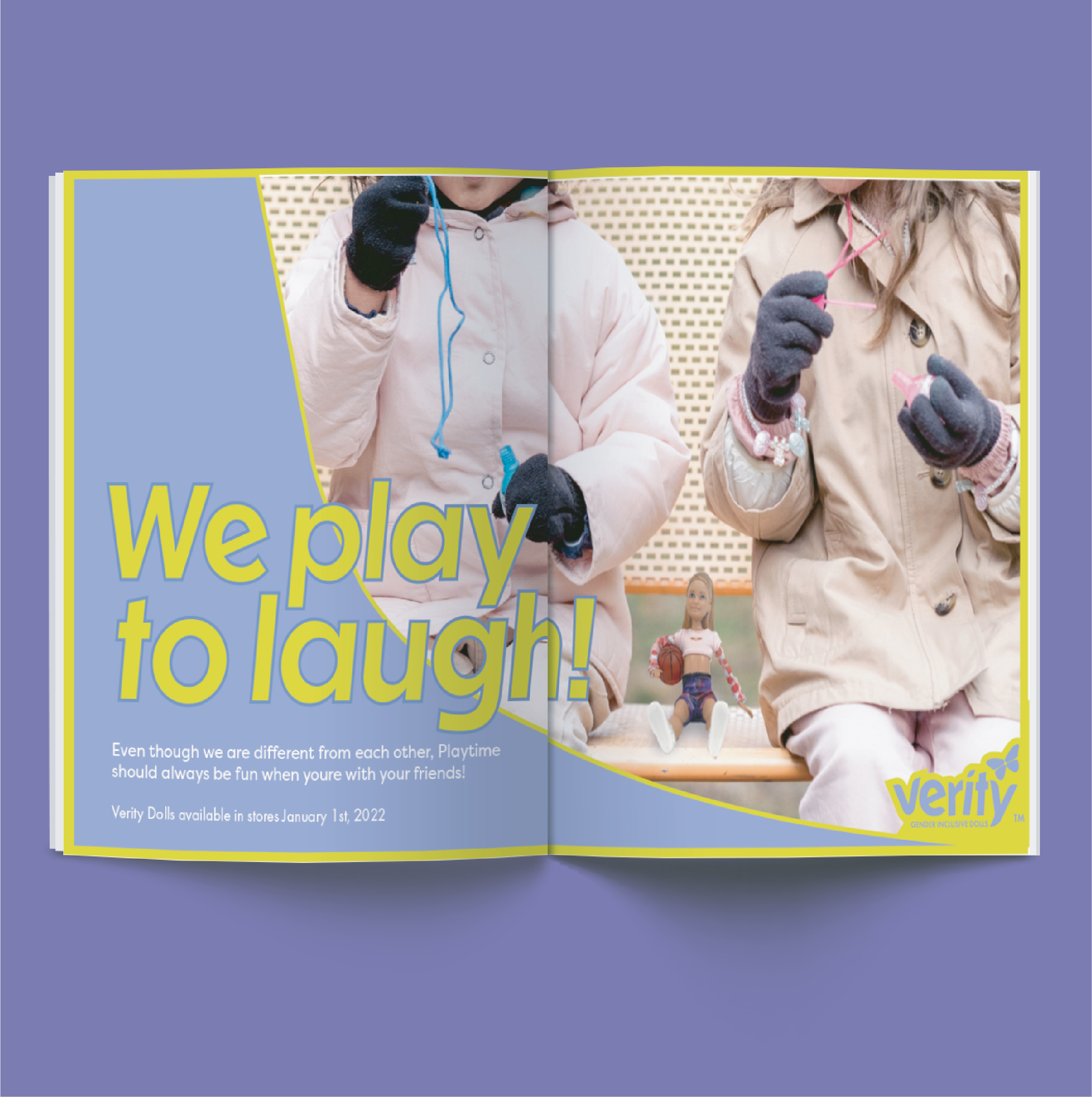
11. Ad Development
When creating the ad concept for the dolls, I initially wanted to draw from the brand tagline, “Playtime should be as fabulous as you are!”; however, while keeping the concept of playtime in mind, I decided to promote the importance of these dolls. Essentially, I asked myself, “Why do we play?” This brought me to the concept of We Play to... This concept allowed me create ads that would engage with both younger audiences and their gaurdians.
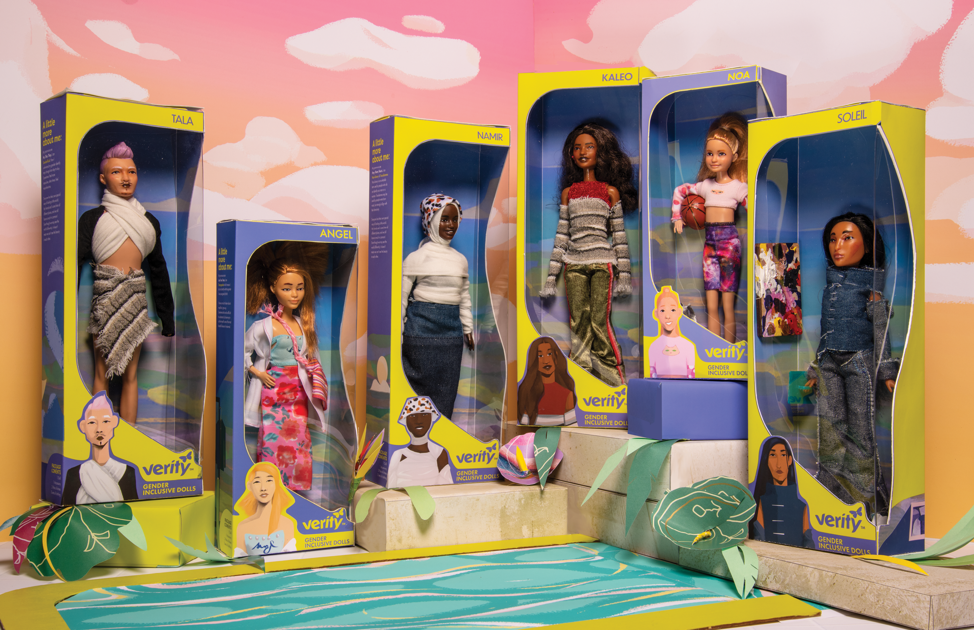
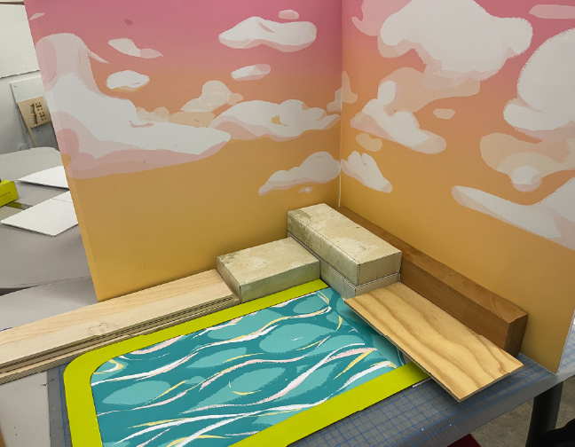
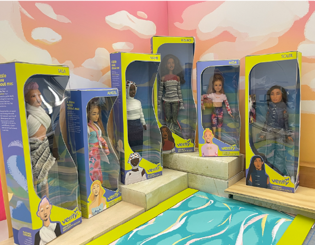
12. Product Photoshoot
The final element of this project was to create a set that would be used to photograph the dolls. Because the story takes place in Los Angeles, I wanted to integrate a beach,summertime ambience into the set design. I also wanted to maintain the childlike energy associated with playtime.To achieve this look, I wanted to use paper crafts to create the scene.
Upon creating this set, I illustrated the sunset backdrop and the pool, created fake concrete blocks for level changes, and created paper leaves and flowers for a fresh and lush feeling.